Why can some people make their home look stylish, cosy or just plain brilliant when others, no matter how hard they try, simply make a mess of it? The answer is simple – they have not read this article about DIY Interior Design Decorating and learned the rules! (Which are not complicated, nor difficult.)
In this article we first explain the basic elements of Home Design starting with interior design and then we follow up by listing useful tips and hints on a room-by-room basis.
Basic elements
The four basic elements of interior design are:
- Light – the effects of natural and artificial light on interior spaces.
- Colour – how to select colours that go well together.
- Texture & pattern – how to add areas of visual interest in a space.
- Scale & balance – if the proportions are wrong, an interior space will look strange or uncomfortable.

Light
Light defines a space. Brightly lit spaces can feel larger than they actually are. If a space is too dark, it will feel gloomy or depressing. However if a space is dark but contains pools of warm light, it can feel very cozy
There are two types of light, natural and artificial. Both can be controlled and manipulated to benefit a space. Windows, curtains, blinds, shutters, overhangs, skylights, tinted glass and coloured glass can all be used to manipulate the quality and intensity of natural light entering an interior space. Artificial lighting is typically manipulated by two factors:
- The type and power rating of the light bulb
- The design and physical position of the bulb’s enclosing light fixture
Colour
Colour is the quickest and most dramatic way to transform almost anything, especially an interior space or room. However you need to be informed before you grab a brush. Listed below are some helpful resources:
- Picking colours for your home
- Colour selection rules for your home
- The use of neutral colours
- Colour Palettes for Interiors
Texture & pattern
Adding textures and patterns to a room is often an accidental byproduct of furniture selection and the selection of other items such as flooring, paintings and curtains. But although textures and patterns do not evoke anywhere near the same intensity of emotions as colour and light, they should still be considered when designing and filling a space.
When using textures and patterns in interior design here are some basic rules of thumb to keep in mind:
- Rough goes with smooth (e.g. rough brick walls offset with linen curtains).
- Matt goes with gloss (gloss windows frames set against a matt finished wall).
- The texture of the floor often dominates a room (e.g. think of carpet versus floorboards).
- Large patterns need to be displayed on a big surface (e.g. carpet or wall hanging).
- Don’t use more than one large scale pattern in a room.
- The same (smaller scale) pattern in two different colours can look good.
- Many companies now produce coordinated collections of patterns on paper and fabric.
Scale & balance
In the context of interior design scale refers to the size of an item in room with respect to the overall size of the room itself.
Balance refers to the collective and contrasting weights, heights and colours of each item in the room. If there are too many “heavy items” the room can appear oppressive. If there are too many tall items the room may feel too formal.
Professional interior designers, as a rule, recommend that you scale items in a room “up” rather than “down”. In a small room smaller items can look boring or bland. Adding a larger item will trick the mind into believing a room is spacious.
Planning your DIY interior design & decorating
Those who fail to plan, plan to fail. Here’s what you have to do avoid as many problems and pitfalls as possible:
- Draw a rough floor plan of the space you are designing. The plan must be drawn to scale. Scaled graph paper can be purchased from your newsagency.
- Create some cut-outs to-scale; e.g. kitchen cutouts & bathroom cutouts.
- Move the cut-outs of the furniture and fixtures around the room until they are arranged in a manner that you believe will work well without being crowded, hazardous or in conflict with windows and doors. You may have to sacrifice some items.
- Decide on a colour scheme and then shop for paint. Remember that you can purchase sample pots before you buy, this is a lot cheaper than buying 20 litres of the wrong paint that you selected from a colour brochure. The paints you sample will need to be applied onto differently oriented walls and assessed at different times of the day, it is only then that you should commit to a final colour.
- Wall furnishings, the latest name for wallpaper, is back. Look online for the following items to fit-out the room (as applicable):
- Window coverings such as curtains, blinds & shutters
- Floor finishes including carpets, rugs and mats.
- Lights: ambient general purpose lighting, task lighting for work areas and feature lighting.
- Furniture (don’t forget about scale and balance)
Walls
Until recently there has been a limited selection of internal wall lining types in Australia. Many people building or renovating are unaware that there are other choices besides Gyprock. Three dimensional wall linings are now available in Australia, and what a great choice we now have!
The product comes in large light-weight tiles that are easy to work with. They are designed in such a way that when the panels are butted together they form a pattern, similar to the way wallpaper patterns line-up. Once the panels are glued to the wall, the joins are filled and then sanded back. After installing the product the wall can be painted. 3D wall linings are often made from the biodegradable fibres such of crushed sugarcane stalks.
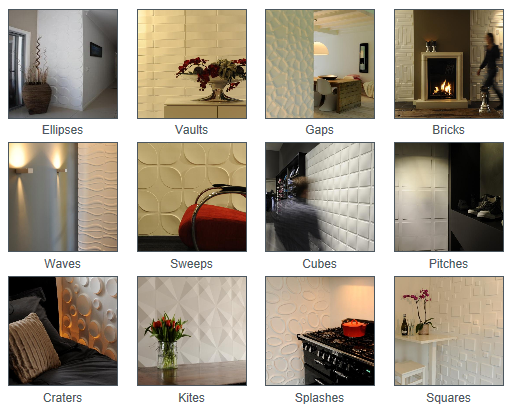
Eco friendly wall panels. Easy to install yourself.
Wall decals
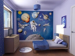
Wall Mural picture
supplied by Crockers
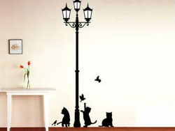
Wall Decal

Wallpaper
Wall decals are the perfect alternative to hand painted murals, for those who like to change their wall decor every few years without the hassle of repainting. It is quick and easy to apply to any smooth surface. No paint, no tools, and no wallpaper paste required. Just peel and stick these wall decals to any smooth surface to create your very own wall mural. These removable wall stickers are made of vinyl material with low tack removable adhesive and can be easily removed without leaving a sticky residue or harming surfaces.
Murals
If you are looking for another option other than paint, a wall mural maybe the option for you. There are many designs from photographic scenery, to walls of flowers or roses, or rooms with views. Whether you like the bush, the beach, the water or the garden, then there is something for you! Wall murals usually come in either 4 or 8 panels, and door murals come in 2 panels. They are unpasted and require a good quality wallpaper paste for application. Wall preparation is the same as for hanging wallpapers, and all murals come with instructions. The panels are made to match on the insides, and on the ends, so if a mural needs to be trimmed to fit, then it can be trimmed on the outside perimeter.
Contact paper
Contact paper is another way to revamp your interior, yes contact!! This product has come a long way over the last 10 years. There are many beautiful designs coming out of Germany, and these products have been specifically designed for wall and furniture use. This self adhesive product is a superior paper made for lining cupboards and shelves, covering furniture, kitchen benches, and any other items where you need a strong self adhesive decorative covering. You can even cover the front of a fridge, or a kitchen splashback with the stainless steel finish. Each roll or metre has a peel off back that has centimetre grid measurements, making it easy to cut and measure with accuracy.
Artwork & Paintings
Size and color are the major criteria for selecting art. Art that is too large will overwhelm. Art that is too small will be lost and look out of proportion. As a general rule, paintings should be hung so that the center of the painting is at eye level.
When selecting a painting to match color, select one or two of the boldest colors in the room and and find painting that compliment or match those colours.
Kitchens
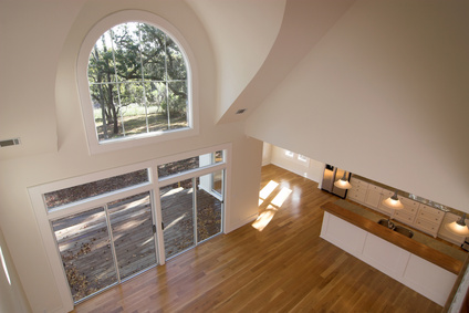
Unfurnished open plan kitchen, living area and
adjoining outdoor area
The way we live today sees the kitchen as the hub of the home and in many new houses this area is open to the dining and family spaces. Older unrenovated homes still display kitchens cut off from family spaces. This is a tradition stemming back more than a century, when wealthy and middle class homes typically had servants because the vast majority of people lived in abject poverty, and cooking and cleaning was relegated to “the staff”.
Many people would assume if a kitchen is totally cut off from the dining and family spaces removing as many walls as possible to provide a large open plan feel is what is required, this is often not the case. Take a look at Seven deadly sins of home design and study the plans below to see how better planing can give you more than just one big open plan living space.
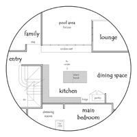
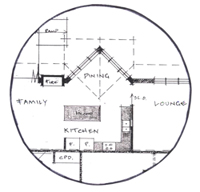
The plan on the right offers a warm and intimate window seat that faces the kitchen area. The arrangement allows users in both spaces to easily interact with one another. The kitchen faces the glass doors to both the lounge room and the family rooms, allowing verbal and visual interaction with theses spaces. The glass doors allow these areas to be acoustically and thermally disconnected if required.
Next, given that kitchens and bathrooms are the most expensive rooms to build and fit out, you need to decide on a budget and then create a plan.
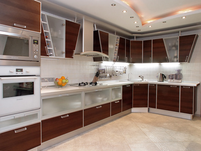
Zoned kitchen
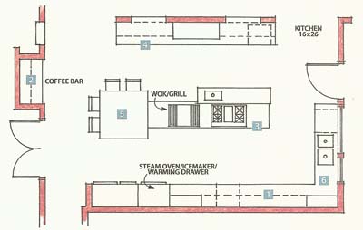
Kitchen plan with activity zones
DIY Interior Design & Decorating – Kitchen design tips
Keep the following points in mind when designing your kitchen:
- Consider designing your kitchens with activity zones, especially if you have a large family. Activity zones can be for food preparation, cooking, washing-up, and fetching a drink like a coffee.
- In a family kitchen you will need at least two entries to main family area otherwise your kitchen will seem cramped and congested, gallery kitchens are notorious for this.
- Always allow a nook for a broom and mop, it may be part of your pantry.
- If possible have an adjoining outdoor area such as a deck or sun porch where the boundaries between indoors and outdoors are blurred. Most of Australia has the perfect climate for this type of arrangement and it provides great ventilation if required.
- Due to their calming effects, soft muted colours are ideal in a kitchen/family-area. Using softer colours has the ancillary benefit of making the kitchen and family areas seem larger.
- If using white or cream as your primary colour add tonal depth by having a darker floor or cabinets.
- Don’t forget to have plenty of open storage space in your kitchen. Built-in or freestanding cabinets are not enough. Open shelving is the most commonly used type of open storage. Another nifty idea is bi-folding doors behind your benchtop opening to shelving, this is great for storage and allows kitchen items used daily to be close to their storage location.
- If you have the space and the budget, put in an island bench, with storage space underneath and above.
- Two sinks, side-by-side are always better than one, even if you have a small kitchen.
- If you enjoy entertaining consider a theatre style layout for your kitchen. Theatre style kitchen have an inward looking seating or bar area where guest sit and watch the chef in action (and eat yummy appetizers).
More about kitchen design (additional reading)
Bathrooms
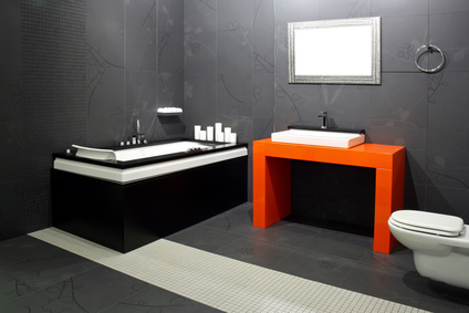
A bit of colour can go a long way
After kitchens, bathrooms are the most expensive areas in the home to build or renovate. How to design your bathroom depends on how much the bathroom is used and for whom it is intended. An entire family using one bathroom warrants more facilities (like double showers, basins) than a one person bathroom. If your bathroom is to incorporate laundry facilities, it may require additional power and plumbing outlets.
Bathroom design tips
- Consider a skylight if the bathroom is dark or positioned away from northern or eastern sun.
- Relate the colour scheme of an en-suite bathroom to that of the master bedroom or any other space it may open onto.
- Use neutral colours in a bathroom. They will stand the test of time. Renovating that includes replacing tiles, re-waterproof and installing new fittings is labour intensive and expensive.
- Even the smallest touch of colour can have a big impact, use it sparingly on items such as bath mats, towels and vases that can be easily changed as your tastes change.
- Marble looks great but is cold and slippery.
- Terrazzo floors can look great and are less slippery than marble and both are very expensive
- Vinyl and linoleum floors are easy to clean, not expensive and soft to walk on. These products are making a come back in domestic and vary greatly in price and quality.
- Rubber is more expensive than linoleum, but warm and soft underfoot
- Don’t forget to leave wall space for a washing basket and towel rails.
- Don’t forget to plan for plenty of storage space for personal-care items, towels, extra soap, toilet paper
- In smaller bathrooms consider not having a shower cubicle and tray, turn the whole room into a wet area. Alternatively just have a simple glass divider or a shower door that opens inwards.
- Free standing baths need a minimum of 200mm between walls and other bathroom items for ease of cleaning and for comfortable visual seperation.
- Try using a toilet cistern that is hidden in a timber stud wall or vanity unit to save valuable floor space.
- Remember to allow a minimum of 900mm in front of each fixture (e.g. sink) otherwise it will be difficult and uncomfortable to use.
- Use a large mirror to make a small bathroom seem larger. this mirror could be a bank of mirror cabinets offering loads of storage space while being functional.
More about bathroom designs (further reading)
- Australian bathroom design
- High-tech Japanese toilets
- Choosing better fittings
- Bathroom installation guide
- Tips on how to redecorate
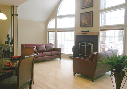
Living areas
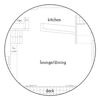
The best designed living areas are informal, comfortable and stylish. They are often part of an open-plan arrangement that includes the kitchen and dining area, thus the colour schemes for all three areas must work well together. Over the years the design arrangement of open-plan has been over-done and now there is a growing trend that is pulling living areas back to the cosiness that older homes provided. Study the plans below to see what arrangement best works for you.
This floor plan is common to many modern homes having a large unstructured open-plan arrangement. The problem with this design is that it is not cosy and intimate, it will be more costly to heat and has the potential of being very noisy, depending on final finishes and furniture.
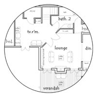
This plan shows the lounge area close to the kitchen with the ability of being cut-off from the main living space as required, great for thermal control and acoustics. Sound travels louder from one wall to another if they are only adjacent and perpendicular. The walls on this plan are at different angles offering acousticrelief.
Large open plan living areas should be subdivided into activity zones and may be separated by something light, like a decorative screen. This is done through the use of different floor coverings for each area and furniture arrangement. A cozy area surrounding a fireplace is always a hit in cooler climates, especially in winter.
Living area design tips
- Create a cozy space for people to read, and if you have the space create other activity spaces or multi-purpose activity spaces.
- Make sure there’s always somewhere close to place a glass or cup of coffee.
- There must be an easy and natural way for people to walk through a room, without having to doge furniture.
- Each area within the room needs a focal point; e.g. a fireplace, window with a view, a television or an attractive coffee table.
- Stereo speakers should be placed against a hard wall or other surface. This will improve acoustics.
- Use a feature wall.
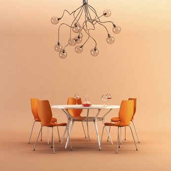
Funky and cheerful dining area
Dining areas
Your design decisions for a dining area will depend on the level of formality you wish to achieve. There are many variables to consider. Here are a few:
- If the dining area is part of a larger open plan family area the best way to distinguish it is to use colours in that area that contrast well with those in other areas.
- Consider painting one wall in the dining area a vibrant colour that looks especially good in candlelight and artificial light. The dining space is the perfect location to have a featured pendent light, proportion and scale to the table are very important as is the centering of the light over the table.
- Use an area rug or some different flooring in the a dining area to help define the space.
- Dining area lighting needs to be both functional and atmospheric. Candles and subdues lights work well at dinner parties. Consider using wall washers, these lights are lovely but you will need to let your plasterer know that you need a ‘Level one’ finish otherwise you will see every little imperfection in the wall. A ‘level one’ finish is more labour intensive so it will cost more and the work needs to be flawless.
- The table you choose does not need to be expensive, but it should be the right size for the area. Allow at least 1000mm between the table edge outwards, to allow for flow of traffic around the table when people are seated.
- Sturdy dining chairs are worth the investment and you should choose a chair that will cater to most people large and small. Think about your friends and family, their size and mobility.
- Consider storing the formal china and other dinnerware in the dining area, rather than in the kitchen. Adding a large piece such a china cabinet may help in achieving the right visual balance.
- Adding a console table to the space works well for space balance, storage and they are just the right height for a vase with flowers.
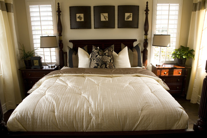
Crowded, yet tasteful, master bedroom
Master bedrooms
If you can afford it, and you have the space, make the master bedroom at least 16 square metres in size, not including the en-suite bathroom and walk-in closet. If you can spare a little more space for a single-seater lounge chair do it, sometimes this is the only quiet space you will be able to retreat to if you are part of a growing family.
In addition keep in mind the following:
- The bed is the dominant feature of the room, allow a minimum of 900mm on each side for traffic flow. The style of bed you select, and the textiles you cover it with, will set the tone of the room.
- Upholstered headboards provide something comfortable to lean against as well as warmth in winter. These ends are easy to recover if you change your style a few years down the track.
- Don’t locate a verandah off a main bedroom unless you have a kitchen near by, these verandahs generally don’t get used unless you can easily get out there with a cup of tea.
- Subdued colours combined with occasional strong accents work best in bedrooms. Bedrooms need to feel restful and the use of soft gentle colours will help achieve this.
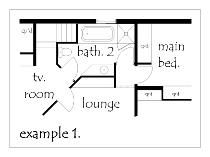
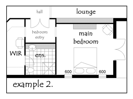
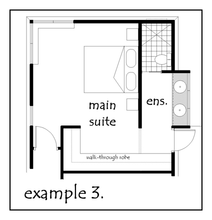
- Never have a en-suite opening directly onto the bed space, there is no reason for a person sleeping to be privy to all the bathroom services. Three examples of good design are shown below:
- The solar orientation and location of any bedroom must be given great consideration. You need to think about the family members, do they do shift work, are they early risers to they need absolute silence to sleep well.
- Ensure your bedroom is well ventilated with good cross ventilation.
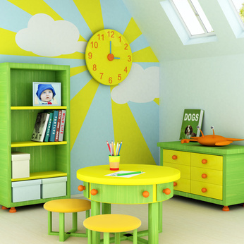
Children’s bedrooms
When designing, furnishing and decorating a child’s room the age of the child is the most important consideration. Below are some tips for various ages.
Nurseries for babies
A nursery is as much a parents room as the child’s. Parents will spend a lot of time there. The key things to remembers are:
- Make absolutely sure the cot meets all Australian safety standards.
- The babies room needs to warm and cozy, but also well ventilated
- Have a comfortable chair in the room where mum and dad can sit when feeding or nursing the baby.
- Buy and locate a change table that is within easy arm reach of where your nappy changing accoutrement’s will be located.
- Keep in mind that babies are not babies for long so minimise the use of wallpaper, furniture and other items that can’t easily become part of a toddler’s room.
- A few well chosen bold colours will look great in a baby’s or toddler’s room. They help make it a cheerful, happy place. But remember bright colours can also keep baby up and entertained so keep the walls white and have the colour in things your can relocate if required.
- Set aside some space for a secondary baby change area near the main living space if the babies room is not close to this space, this will save constant traveling to the babies room.
Toddler’s bedroom
Some easy tips.
- No sharp corners
- Fix all heavy bookshelves that can fall onto the child to the wall
- Plan lots of storage for toys so that its easy to keep the room uncluttered and its easy to tidy quickly.
- Most parents like to adopt a theme for their toddlers room, be it a fairytale castle, train station, or zoo. Whatever theme you select, make sure your child, and not just you, likes the theme; and don’t overdo it, that way you can change the themes as the child gets older with minimal expense. Again do the colouring with covers, curtains and carpets and keep the walls white.
For toddlers a bed is a home base, not just a place to sleep. Put the bed in a corner and put a few select favourite toys on it. This will help make the bed a cozy and welcoming place for the toddler.
Ages 5 to 11
Every child in this age bracket seems to become a collector, so they’ll need not just storage space for their toys but also all the other “treasures” they accumulate. They’ll need a combination of built-ins and shelf space, and all the storage facilities needs to be at a height they can easily reach. Consider getting a bed that has built in storage space rather than a bed that simply sits on four legs.
Lastly they will need a workspace for homework and arts and crafts at their own height. If you have limited space a raised bed with a study area underneath is a great space saver.
Eleven and up
As children approach their teenage years their bedrooms become private domains and as such it more up to them how the bedroom is decorated, rather than you. If your children do take advice suggest the concept of defining activity zones within their rooms for sleeping, homework, listening to music and hanging out with a friend or two (if there is room).
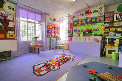
A child will quickly outgrow this play area as well
Other children’s areas
Indoor play area
For toddlers and kids under 11 these just need to be roomy cheerful spaces, with lots of toys and toy storage space and needs to be located in the hub of the living space and near the kitchen. It should be within eyeshot of parents when they’re in the kitchen or family area. It should not be a separate room because as a parent you want to keep an eye on the children’s activities and make sure things don’t get out-of-hand or too wild.
Outdoor play area
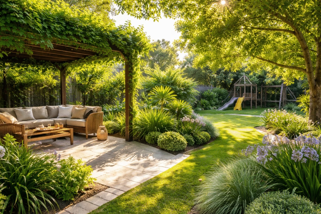
Children love playing outdoors but playing safely outdoors with any frequency or regularity only becomes practical if parents can easily keep an eye on things from indoors or if the children are old enough to be somewhat independent.
For toddlers it absolutely necessary that an outdoor play area be fenced off and attached close to the kitchen area via a door. If the outdoor play area is not located closely to the kitchen/family area and does not have good northern sun the space will be used infrequently .
For older kids it is important to have space for all the equipment they will play that is protected from the weather.
Sandpits are always a hit for children under 7 years of age as are flat sunny grassed areas.
Houses on sloping blocks are not desirable for families with younger children they will prefer to stay indoors.
Teenager Zones
Ideally these spaces should be close the teenagers room and contain all the stuff that won’t fit into their rooms and will annoy their parents, like video game consoles, sound equipment, etc. Expect these areas to be unkempt and messy. This space needs to have the ability to be acoustically cut-off as required.
Additional Links:


